How to Create Visual Presentations SUPER FAST (and for free!)
This is the blog post version of my YouTube video.
Want to know one of my best secrets for making highly visual presentations really fast and for free?
Before I share the answer, I want to make sure you know about my FREE presentation skills training. Be sure to check it out and sign up if you’re interested in improving your presentations right away.
Well, chances are you've been wanting to use more visuals in your lectures, conference presentations, workshops, etc., but you're worried that it's going to take way too much time, or you've already tried it and it has taken way too much time.
Or, you're worried that using stock photos means you can only find super cheesy photos of white guys in business suits giving the thumbs up.
Or maybe you're thinking that you don't have the money to create highly visual presentations because you need to pay for good photos.
Well, I've got a super simple process to help you find photos (a) fast, (b) that are not just cheesy white guys in business suits, and (c) that are FREE!
All you need is a VISUAL DATABASE.
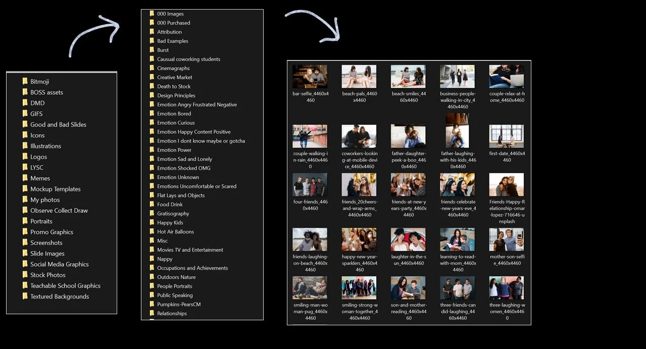
A visual database is just a dedicated folder system of stock photos, gifs, illustrations, and other visuals that you like. It’s organized and set up in a way where you can quickly search and browse through your own computer to find visuals for your presentations.
Now that might feel a little anti-climatic, but just stay with me because this is actually something that has helped so many of my clients in so many different ways (not just for presentations).
I think it will help if we directly compare my idea of a visual database to how you're probably searching for visuals right now. That's going to help you see why it's so different and why that difference will actually save you tons of time while also making your presentations better.
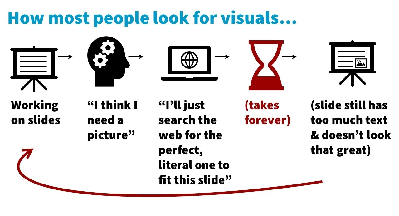
Here's how you're probably searching for visuals. Let’s say you’re working on your slides. You probably create a wall of text (not saying that to make fun of you, that's just what a lot of academics and scientists do!) and you have this moment of, “Oh, this is just a wall of text. I should probably add a visual. I should probably add a picture to make this a little more interesting.”
So you go to the interwebs and you start searching for the perfect photo to fit the slide that you were working on. And it's probably going to take you approximately forever because of that (and because of how you’re searching). Then you probably never even find the perfect visual that you want. So maybe you just give up and you're like, “Okay, this is good enough, I don't love it, but whatever.”
Then you add that visual to your slide. And to be honest, if you already have a wall of text and you're adding a visual to it, it's probably really tiny and kind of looks like an afterthought. So it's not even going to make the huge impact that you wanted.
Then, just to make things worse, you have to start this inefficient process all over again. Because you've spent so much time just looking for that one visual, you lose your place and you have to take time to reorient yourself to your slides to figure out where you were, where you want to go next, and you have to restart that thinking.
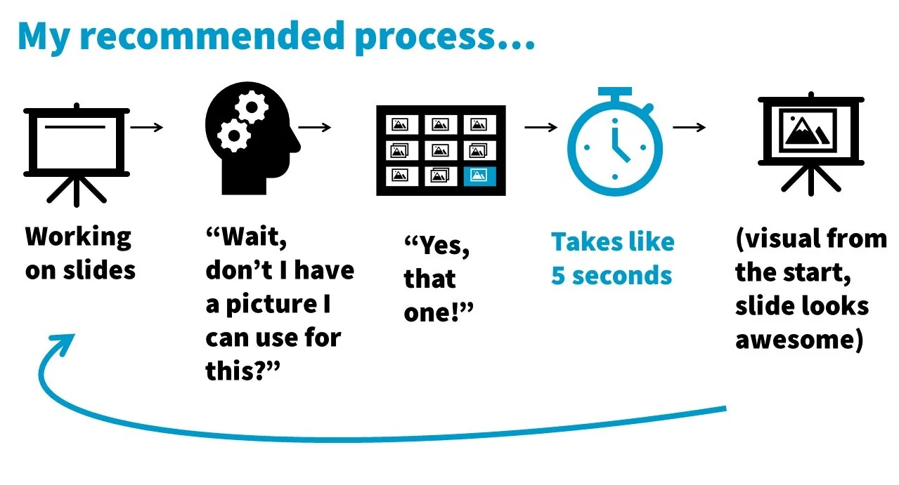
Let's contrast that with my recommended process. When you follow my approach and you have a visual database that you're used to, you've got a lot of visuals, it's become your new habit, it's part of your workflow.
What will happen is you'll be working on your slides and you may write out a few keywords and you'll be more likely to pause and think, “wait, don't I already have a visual for this idea?” Or you'll think, “Hey, maybe I have a visual for this in my visual database.” So you search your visual database quickly and it doesn't take that much time because, again, it's a searchable visual database.
Now you’re adding the visual to your slide earlier in the process, which means you’re more likely to make the visual more prominent. It takes up more space and you don't even have a wall of text.
Because that whole process went so fast you don't lose your spot. You don't really lose that momentum that you had when working on your presentation. So you just pick things up right where you left off.
It's so much more efficient for your brain.
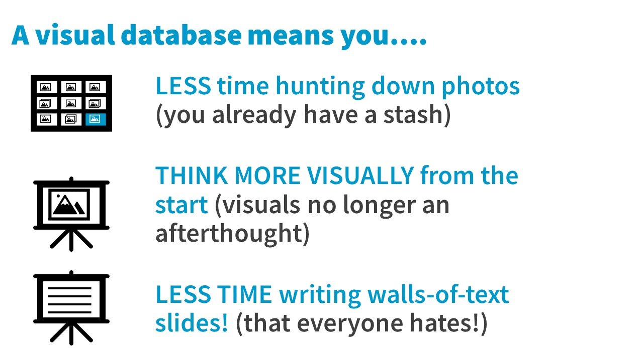
So having a visual database means you are going to spend significantly less time hunting down specific photos because you already have a stash waiting for you.
It means you will start to think more visually from the start. Visuals are no longer an afterthought because you have your visual database and it's always on your mind. It's always kind of there. And you'll want to use all of the photos that you have in there and that ultimately means you will spend less time writing those walls of text slides.
You'll have that visual database waiting. You will want to use it, so you'll be more likely to just go to your visuals and add that to your slide rather than writing a slide with a hundred words.
So hopefully you can see why a visual database can actually lead to a powerful change in the way you create presentations and how long it takes.
So how do you create a visual database? I think you're going to love how easy this is and how fun it can be.
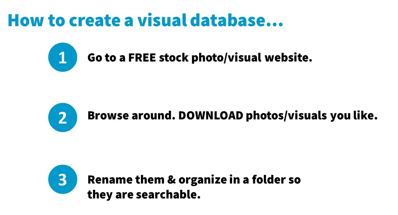
First, go to a free stock photo website (I'm going to share some of my favorites with you at the end of this post).
Second, you browse that website and download the ones you like (the ones that catch your eye, the ones that look high quality, the ones that you can see using in a slide). Don't overthink this. This should go fast. You do not need to have a specific purpose in mind for that photo to download it. Just view it as a download party. Take 15 to 20 minutes and make your goal to download 15 to 20 images.
Third, rename those file names and add some keywords so that you can find them again and so they're searchable. Create a folder system that makes sense for your brain and the way that you think about images and how you want to find them.
The idea is that you're setting yourself up so they're going to be easy to find in the future, whether through searching your finder/file explorer or by browsing all of your folders.
That's pretty much it. Anybody can do this now — you can totally do this!
Hopefully, you’re enjoying this blog post so far, if so, you’ll love my FREE training.
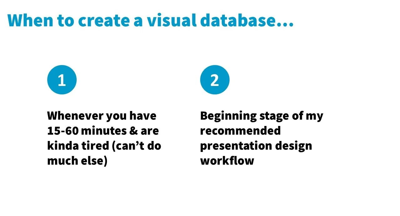
In terms of when you should add to your visual database, do it whenever and frequently.
Personally, I love doing this when it's the afternoon, I'm kind of tired, and I wouldn't be able to do much else, but I don't want to end the day. I still want to do something. I still want to be productive. I put on my favorite music and then I just have that download party. It's actually really fun and I find it very relaxing.
The more it's on your mind and becomes something that you add to every other week or at least once a month, then the quicker you're going to build up that visual database and have over 500 photos. I probably have thousands of photos.
The more I have, the more options I'm going to have when I'm working on my slides.
So, the idea with this is you just add to it here and there whenever you can.
Another great time to add to your visual database is right when you're about to start working on a new presentation and you're at the beginning stage of my stress free presentation design workflow.
So what websites should you go to to find free non-cheesy photos? What are some of my favorite websites for this?
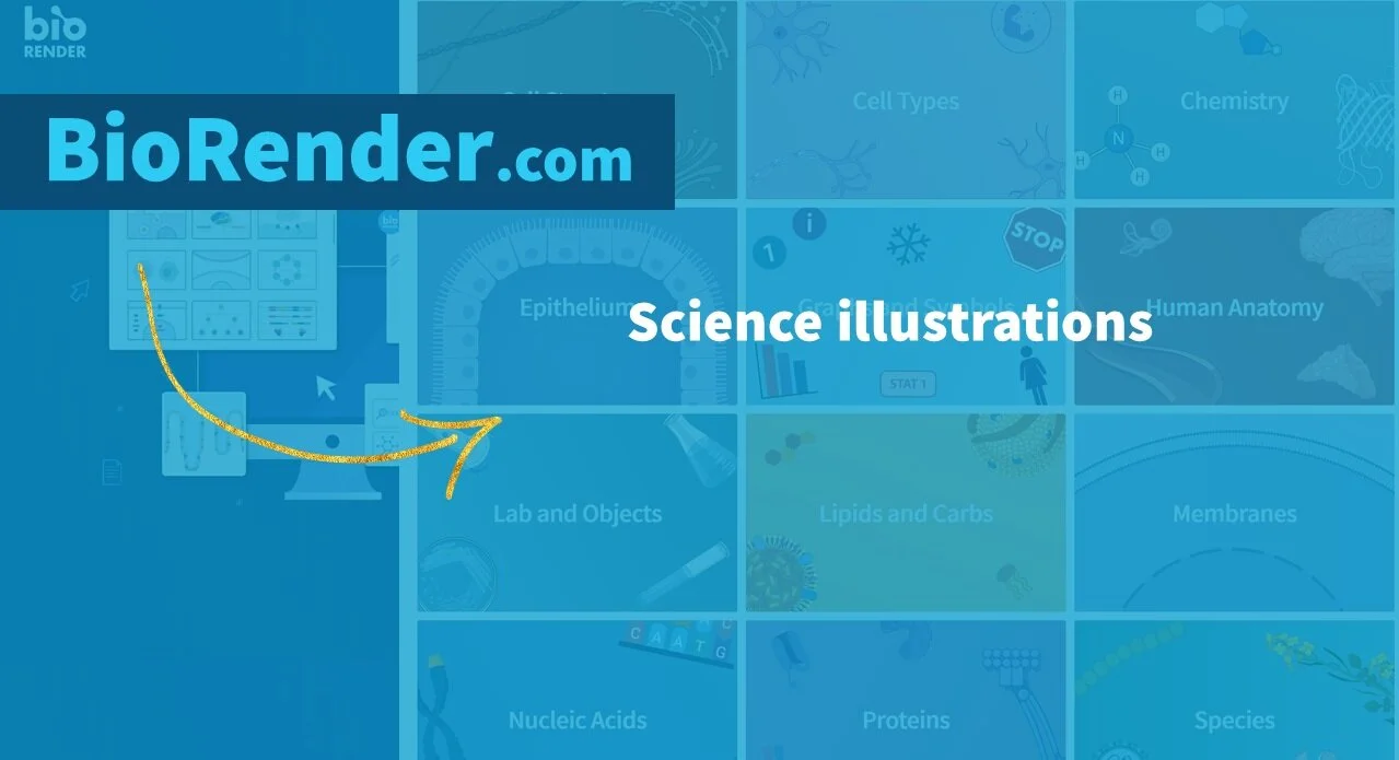
The first website I need to tell you about is BioRender. These aren't photos, they're icons and illustrations, and they are so cool. It's a gigantic icon library for science illustrations and icons of cells, plants, proteins, chemistry, human anatomy, etc. It blows my mind how much is in here. And they have a free account. They also have paid accounts, but the free account is totally reasonable. So check out that website.
The next website I have to recommend is the Women of Color In Tech Chat on flickr.com.
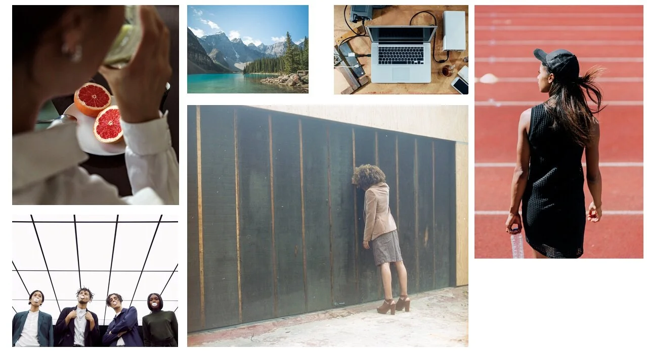
What I like about this website is that it's women of color, mostly black, Latinx, and Asian women, and they're high quality photos of people in meetings, and collaborating, and using things like computers, laptops, and tablets.
These are all things that professionals do, and it applies to a lot of what we do and can be used in a lot of different ways. It's not just cheesy thumbs up images.
I have seen many of these photos on other websites, kind of scattered around, but if you go here and just spend an hour having that download party you're going to have something like over a hundred photos to start your visual database with. That's why I'm recommending you just go there to do that download party and kickstart your visual database rather than just trying to find them scattered across the other stock photo websites.
The next site is DeathToStock.
Now, what happens is if you sign up for their email list they'll send you random packs of really nice photos for free.
(They say every month, but I don’t actually get them every month. Sometimes it's every three months, and I swear one year it was only like a couple of times a year).
But when it arrives, it's a nice little present with about 20 photos. All you have to do is download the folder, drag and drop into your visual database, and boom, you've just added 20 awesome photos to your visual database (and you didn't pay for it).
What I really like about their photos is that they're very unique and artistic. They aren't stock photos in the way we think of them. Like their name promises, they're different and unique. Here are some examples of photos I've received from them over the years. It's a huge variety and, again, very different from the stock photo sites that you're used to seeing.
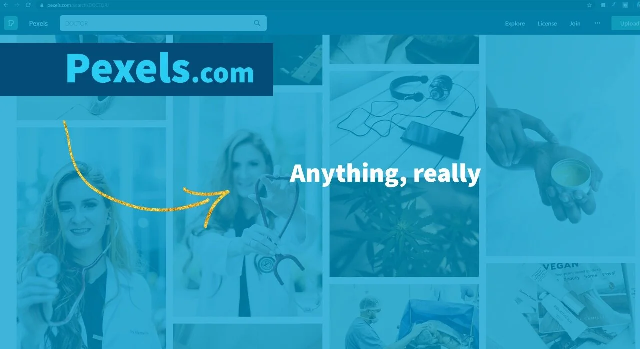
The next website for free stock photos is Pexels.com.
You may have heard of it, it’s very popular and one of my favorites. I love it because I can find almost anything there. For example: Doctors, friends hanging out, couples, food, drinks, dogs, cute animals with lots of expressions. Most of the time I start my search on this website because I can find so many different things.
The last website is probably not going to be a surprise. It's very popular. It's Unsplash.com. So it's not news, but I wanted to talk to you about this website a little bit and add some nuance to this.
Yes, it used to be one of my number one favorites right up there with Pexels, and I do still use it, but it's not quite my favorite anymore because something has kind of happened to Unsplash in the last year. Unsplash is very recently starting to feel like Flickr. I don't know if you've ever tried to find really good photos on Flickr, but it would take me hours. It would take forever because (a) you have to sort through it and you have to find the ones that are available for use under the right creative commons license. And then (b) a lot of the images were just kind of amateur level. Not to be insulting, it's just that you want very high quality photos for your presentations, but a lot had bad lighting, cluttered backgrounds, terrible positioning of the subject. That was what Flickr mostly had. It was like finding a gem when you found a picture that was actually good. So, when Unsplash and Pexels came on the scene it was such a breath of fresh air.
But now Unsplash kind of feels like that. I feel like when I go to that site, I’m spending a lot more time sorting through bad images than I had to last year. I do still use it, but I mostly use it for things that are more whimsical or just kind of rare images, which is why I wanted to at least mention it. But I don't know how I'm going to feel in a year if they kind of keep this up.
Plus, with a lot of their images now it's like they're making it for Instagram. Maybe that's a better way to explain this? I feel like I'm searching for photos that influencers would use on Instagram. They're square and there's no space around the subject, which is what you want for slides.
Now here's a special treat for you for staying all the way to the end. I'm going to share some insider info with you. A lot of people in academia recommend Pixabay. I didn't because you have to be extra careful on that site. There is a ton of clip art and cheesy, outdated photos.
For example, above there's a screenshot of Pixabay image search results. There are only two photos on here where I'm like, yeah, that meets the criteria of what you want for photos to be included in your presentation. All of the other ones are cheesy, cliche, outdated, and won't work for your slides.
I use Pixabay when I need to find image examples of what academics, scientists, researchers, and evaluators should avoid. So keep that in mind—if you haven't had training on how to choose modern high quality visuals, like the one that I have in my online course or my workshops. I recommend that you avoid this website. Otherwise, you are risking using a photo that is just not good.
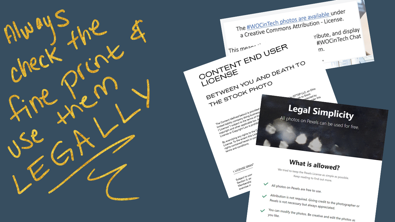
Finally, make sure you've read the license section for all of the free stock photo websites, even the ones on this list, plus other ones that you find. You have to make sure that you use them legally. A lot of academics make the mistake and think that if it's for a nonprofit purpose that they can just do whatever they want and use images however they want to, and that is not true. You are held to copyright laws, so read the license section. They will tell you what you can do and how to use their photos, and whether you need to give credit or not. Make sure you're reading those because each website has a different license.
If you're already a member of my paid online course Blast Off to Stellar Slides!, then make sure you check out the Create Your Visual Database Masterclass if you haven't already because I share a ton of links to other websites in there, including my number one favorite website where I constantly look for most of my photos. I didn't share that in this post (it's a secret one for you). So be sure to check that out if you haven't yet, or just ask me in Slack and I will tell you. And just as a reminder, that Masterclass includes tips on how to find high-quality, non-cheesy photos. Plus you have tips for that in the course, as well.
Now you know my best secret for creating highly visual presentations really fast and for free.
Your action item today is to get going with your visual database right now, sign up for Death to Stock, go to Women of Color In Tech chat on Flickr, and have a download party. And don't forget to rename and organize them!
with joy,
Echo Rivera, PhD
Links shared in this post >>
Additional Reading >>


