6 things no one tells you about designing and delivering engaging presentations that might surprise you
In my last post, I shared 4 things that everyone tells you about being an effective presenter that you ignore anyway. I wrote that post first to acknowledge that I know you know a lot of information about effective presenting already. And that, for some things, you just need some new strategies to implement them.
To continue this theme, I’m going to write about 6 things that no one has told you about effective presenting. Or, at least, these are things that surprise most people who take my training. 😛
If you know all of these already and are delivering the type of presentations that gets you tons of compliments, then awesome! If you know all these already, but your presentations still aren’t what you want them to be (or you aren’t getting rave reviews like you think you should) then I share some resources to help.
#1) PowerPoint is not the problem; Learning new slide software is not the solution!
Almost every day on social media I see someone asking one of the following questions:
“I want to make more engaging presentations, what slide software should I use?”
“I want to make presentations that stand out, what’s a good PowerPoint alternative?”
“I think my PowerPoint slides are kinda boring, what do you think about using Prezi? Canva? [insert new slide app]?”
My reaction to seeing these questions is usually the same:
I’ve lost count of how many times people have watched my engaging, visual presentations and asked, “What slide software is THAT?!” 😆
The answer is only one of two things: PowerPoint or Keynote.
But, most of the time no one believes me when I say that in a tweet or FB comment, and you probably still aren’t convinced yet either. There’s only been one way I’ve been able to convince people: By presenting to them.
So if you think that PowerPoint is a problem and dooms you to create boring slides…or before you spend time learning how to create slides in a new software (even Google Slides, tbh), then do yourself a favor and watch my free training:
#2) A template is not the solution; it’s part of the problem
Related to the first one—and perhaps even more common—I see someone asking a version of this question:
“Does anyone have recommendations for where I can find good slide templates?”
Whereas the first one was probably good news (i.e., no need to spend time learning a new program), this one is probably going to be bad news.
It’s bad news because if you’re looking for a good template then it means you’re looking in the wrong place for ways to improve your presentations. Templates (those pretty shapes and random designs) tend to make you go in the wrong direction (at worst) or make no improvement in your presentation (at best).
Thinking that PowerPoint is the problem and that templates are the solution are both the result of this common incorrect belief: That your presentations can be more engaging with surface-level design tweaks rather than changing your bad habits as a presenter.
OUCH!
Oof.
Damn, Echo.
Sorry. I don’t actually mean for this to be painful, I swear. But it’s the truth that 99% of the people I work with need to hear. And please know that I’m saying it with understanding and compassion 😭❤️. Besides, I’ve been exactly where you are! I’ve made the same type of slides I’m now saying are a problem.
And, I’m putting this in a blog post because I feel bad every time I have to turn away someone who wants me to create a template for them, or who wants me to “spruce up” their slide design when a larger overhaul is needed. Part of the reason I’m writing this blog is so that those folks don’t feel bad when I say that and can see it’s actually a pretty common problem!
And don’t worry, there’s hope! I have FREE training available that will help you see what I’m talking about.
#3) It’s not just about having effective presentation “skills”
Once people decide they want to make better presentations, it’s hard to know where to start. So, most people start by snatching up a bunch of random “tips” or “tricks” or “hacks” or they start learning some discrete skills. For example, they’ll take graphic design training or data visualization training.
It’s not the worst thing to do, don’t get me wrong. But the problem comes in after you’ve learned those skills and you have to try to put it all together.
Because, here’s the thing: it’s not obvious how to do that. I explain this further in another blog post, about how taking a “baby steps” approach isn’t as effective as you think.
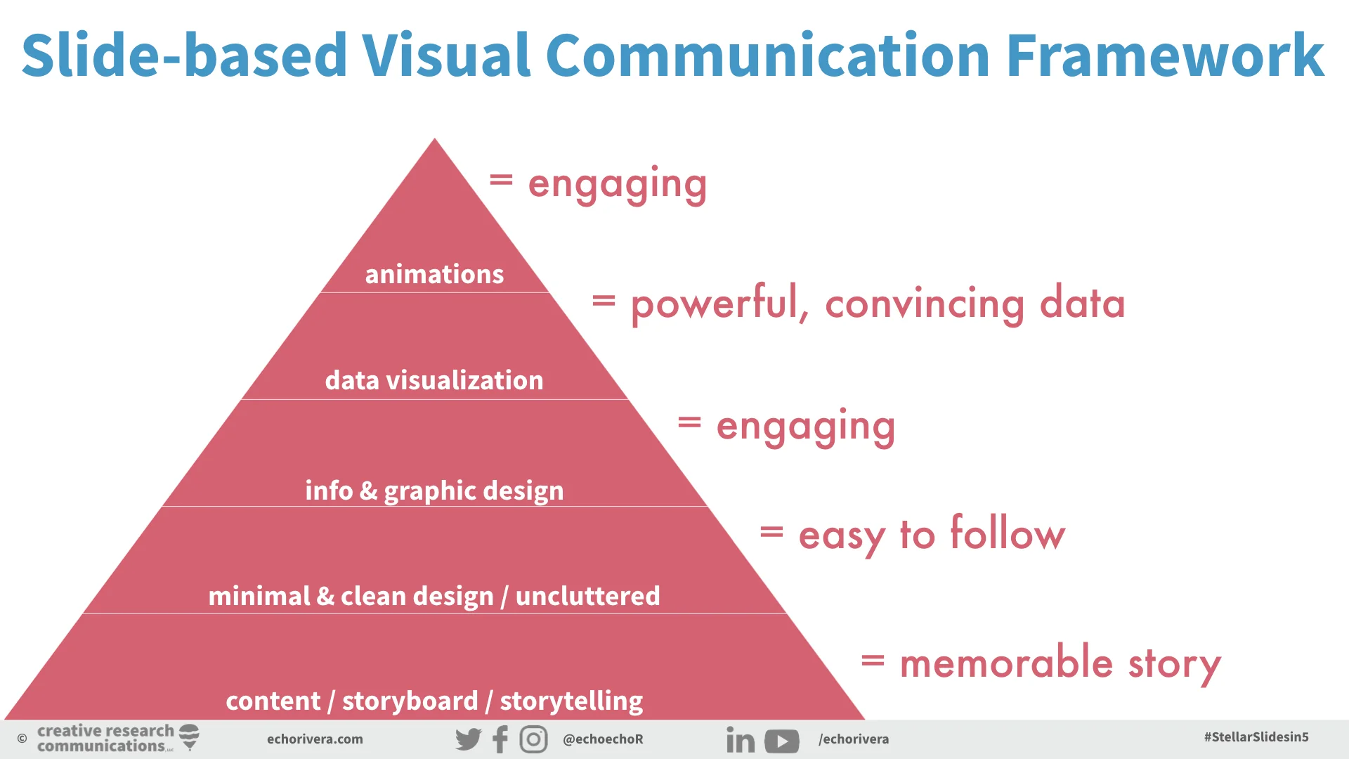
What you should be investing your time and energy into learning is a framework. A way to approach effective presenting. Here is the framework that I use to train people:
#4) We were all kinda set up to fail, so it makes sense #DeathByPowerpoint is the status quo
Let me ask you a question: How many research methods and/or statistics classes were required in your graduate program?
Follow-up: How many effective communication courses were required in your graduate program?
I’m gonna guess that you had an actual number in response to the first question, and your answer to the second was a zero.
So let’s think about this together: Both research methods/stats and communication are expected activities of researchers, scientists, academics, and evaluators. (Or, in some cases, you aren’t doing research/stats so you’re only doing communication).
Yet, only research/stats were required courses.
What’s the unstated assumption here?
ANSWER: The assumption is that research methods/stats is something that requires training whereas you can learn effective presenting by osmosis, watching others, learning a few “tips” and “tricks” or just by finding a new template.
We’re somehow expected to (a) learn new material, while also (b) learning effective presentation strategies? That’s how we’re supposed to learn?
Where else does that even work?
Can you learn how to bake a cake, just by watching a chef bake a cake?
Can you learn how to be an effective course lecturer, just because you’ve taken classes?
Can you learn how to conduct statistical analyses, just by watching someone write their SAS or R code?
See? Now it all makes sense: no wonder there are so many #DeathByPowerpoints out there! Few of us received proper training on how to communicate effectively in different ways, including when using slides.
So, yes, I write posts that talk about the mistakes you make when designing or delivering your presentation, but it’s not because you aren’t smart enough or you aren’t trying hard enough.
The root cause is that there is a huge gap between what we’re expected to do and what we’re trained to do.
So, we fall on old habits or strategies to fill this gap. We do things like trying to learn effective presenting in ways that actually waste our time and money. For example, I explain that in this post about how taking a DIY approach to learning effective presentations will, by default, waste a lot more of your time and cost you more money than just taking some professional development.
But, I’m not writing this post just to complain. My hope is that I’ve articulated something that’s been frustrating you for a while, but you just didn’t know why you were so frustrated. Now you do.
And, I’m trying to fill this gap with my professional development and training services. So all is not lost!
#5) It’s totally possible to create visual & engaging presentations without it taking forever
Let’s start with the bad news: you’re probably not spending enough time on your presentations right now, especially if you’re still doing the things I talked about in my last post.
But I have good news!
You probably don’t need to spend as much time as you think to create presentations that are more engaging and more effective than what you’re presenting right now.
The reason for this is because I’m 99% sure that you’re wasting a lot of time right now when you design your slides. You’re probably doing things manually that could be automated. You’re probably wasting time looking for visuals. You’re probably formatting your visuals in the wrong way and making them worse. I could go on.
Once you learn exactly what to STOP doing, and what to start focusing on, something amazing happens: You start creating more effective presentations in the same amount of time as you’re spending right now creating ineffective #DeathByPowerpoint ones.
Wouldn’t that be nice?
And pretty soon, something even better happens: That gets easier and you get faster over time.
So then, after that, you can decide if you want to spend more time on your presentations. If so, you’ll have the strategies you need to take it to the next level!
#6) It’s a worthwhile investment of your time, energy, and money
Everything in this post has been leading to this final point: This is why training is such a good investment of your time, energy, and — yes — even your money.
You will learn what really needs to change about your presentations right now—things that actually matter and aren’t surface level, like changing slide software or buying templates.
But, if you take the right training, you will learn a framework—or way to approach—your presentations so that you can design better presentations in the same amount of time (or less time) than you’re spending to create ineffective ones.
You will also save a significant amount of time and energy compared to trying a DIY approach. And, if you consider your time valuable then, in a sense, it’s also saving you money by preventing you from wasting any of your available time.
I hope that you learned a lot in this post and, if so, there’s a ton more waiting for you in my FREE training!
with joy,
Echo Rivera, PhD


