[VIDEO + BLOG] SLIDE MAKEOVER #2: How to improve your slide design even if you don't have time to add visuals
[VIDEO + BLOG] SLIDE MAKEOVER #2: How to improve your slide design even if you don't have time to add visuals
I recently asked my email list readers to submit their slides for a possible makeover. The deal was this: if I selected their slides for a makeover, they would get the revised PowerPoint or Keynote file back and I would publish it on my new YouTube Channel.
I had no idea what to expect from this request. Would people even be interested in that? What if I couldn't think of anything to do or improve? What if it's a topic that I don't even understand? So yeah, I was kind of anxious, but I did it anyway.
And I'm so glad I did.
People were interested and submitted some great slides for me to work with. Most are not on my topic, but that ended up being just fine. I still had design ideas to share. You can watch the first makeover here.
This is the second makeover of this mini-series. It was submitted by Dr. David Dreyfus.
Watch the Video
You'll definitely want to watch the video for this, because a key design change I made was to use animations and to create a series to walk people through this content.
Video Notes and Screenshots
David's slide deck is a great representation for the types of slides that we've all seen (and created):
Mostly text (he did use visuals in other slides)
Bullet points
Template
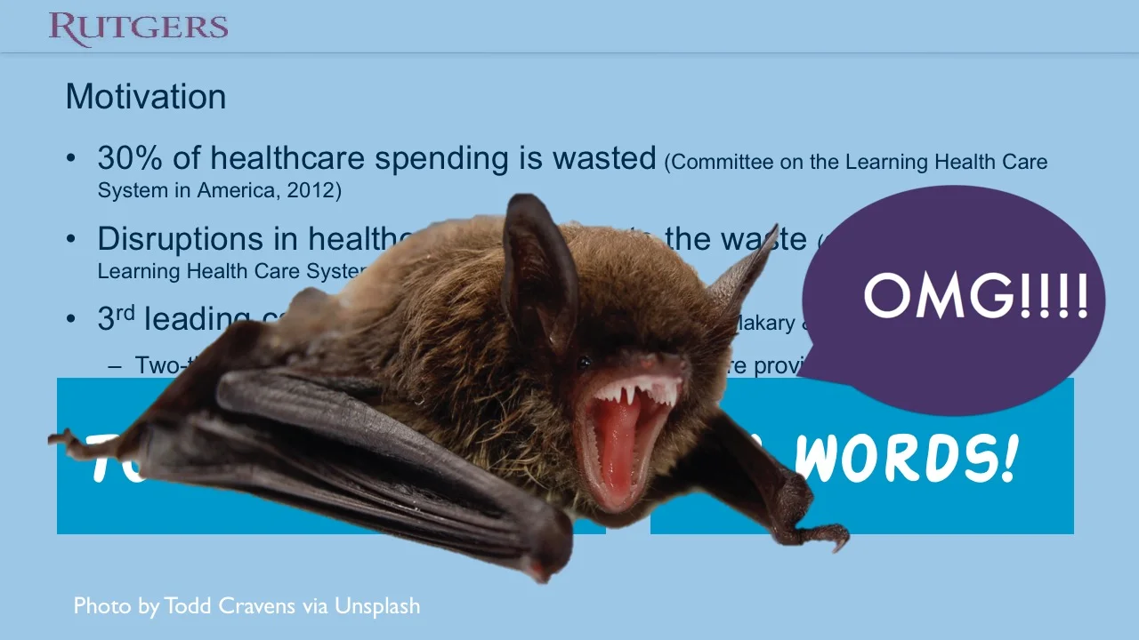
Because of the amount of text on this slide, it did not fare well on my Ban All That Text Scale (BATTS).
But I'll be honest: that's what I enjoyed about this makeover. It's kind of like a blank slate for me when it's all text -- there are a lot of directions I can go.
Plus, all of us can relate to having this type of slide. I've made them, you've made them, we've all made them. And I do not use a visual on 100% of my slides -- so it's important to know how to design text well. Basically, this makeover was a chance for me to show you that you can make some big improvements with very little time, and still using text.
Slide Makeover #1: From text to ... well, text.
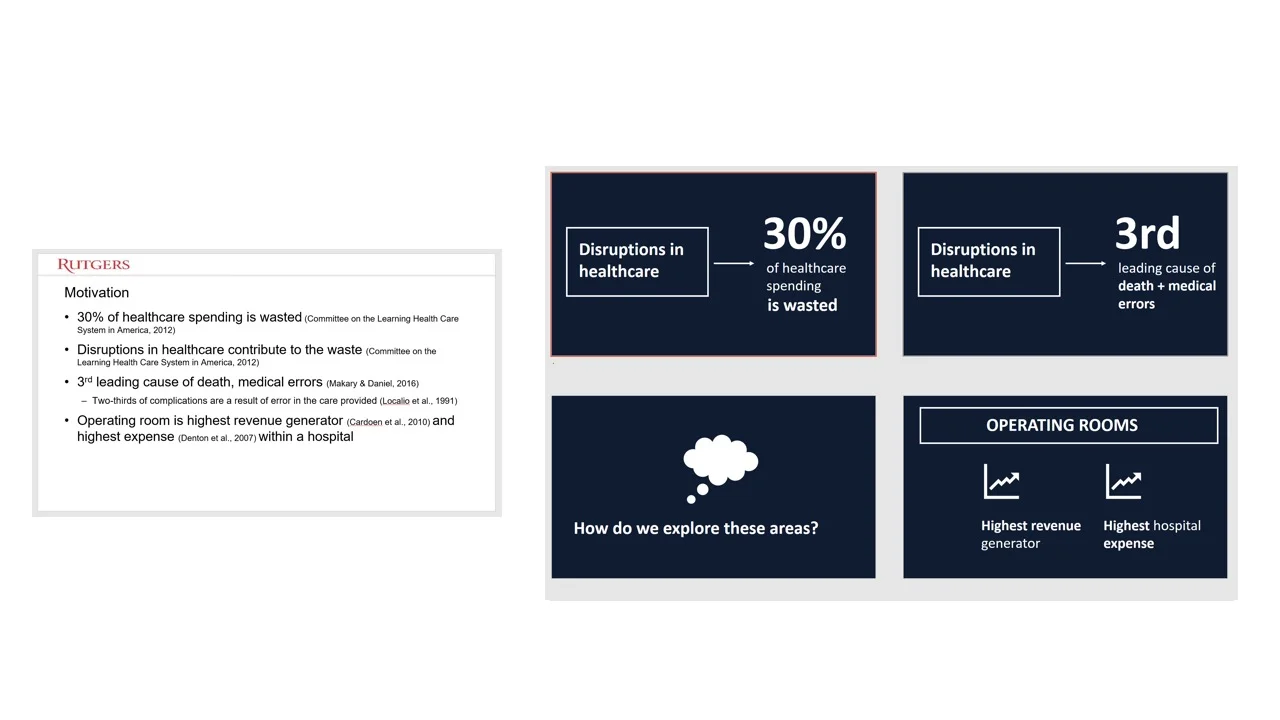
Here is the before and after for the slide:
What you don't see in this static image is the animations for the first few slides. But if you look closely, you can see that I have almost the exact same amount of text on the slides in the after -- it's just broken up more, and I used some of the design/animation skills I've built over the years to spruce it up.
Slide Makeover #2: From text to visuals.
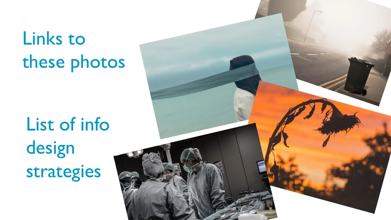
Then I did a makeover of the same slide but used visuals.
Make sure to watch the video, which walks you through the changes I made (and why). And be sure to subscribe to my YouTube Channel, like the video, comment, and share!
Download the Show Notes!
Thanks for reading!
Hopefully, you enjoyed this blog post. If so, you’ll love my FREE training.
with joy,
Dr. Echo Rivera


